
I have had my bridal styling business for a couple of years now, and I am up to my 3rd website version, with my fourth to come with the launch of my upcoming online education (YAY). I get embarrassed thinking of my first ever website design and content, it’s definitely come a loooong way from the early days and I have learned a LOT from my fails..
I want to share my learnings with you because there’s absolutely no sense in us both making these same mistakes!
As a hairstylist our lively hood comes from bookings. If we don’t have any bookings, we won’t generate revenue and in turn have no business to run.
Bookings are EVERYTHING.
What if I told you there are 6 common mistakes I often see that could be drastically affecting your enquiry and booking numbers?
They are easily avoided and corrected, so if your site needs a little brush up, no need to fret – I have the answers for you. Let’s get your website on point and the bookings flowing in so you can build the business of your dreams quickly and efficiently – and get back to doing the creative stuff you love asap!
If your website is not converting.. Here are the common mistakes I see and how to avoid them:
1. Not having a clear heading
A clear heading at the top of your home page describing what you do is essential to quickly qualify that your ideal website guest is in the perfect place to start their customer journey with you.
Think about combining your ideal client’s wants with your service offer to come up with a headline unique to you and your business.
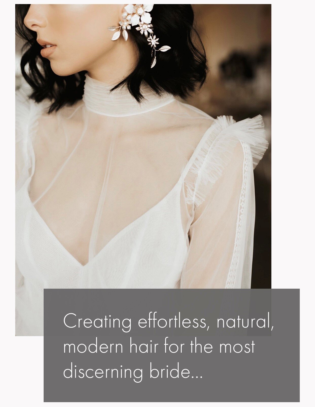
Mine is - “Creating effortless, natural and modern hair for the most discerning bride.”
Already with the heading alone, I have qualified I style weddings only - and the type of styles bridal parties can expect from me.
Be specific with your heading and what you offer, remember if you try to talk to everyone, you’re essentially talking to no one. When we niche down, we attract the right types of clients who value what you have to offer.
2. Utilising testimonials incorrectly

Sharing testimonials is a no brainer for selling our services as they are the ultimate social proof for you and your business.
I see testimonials being added to websites but often not being utilized to their full potential.
Putting them down the bottom of the page or giving the there own dedicated page to be flicked through by your viewer are common ways of sharing clients feedback, and both definitely have their place.
What really creates impact though - is peppering your favourite testimonials throughout all pages of your site, as they are supporting your message and backing up everything you are saying in relation to your business and service. Use this type of past client feedback to encourage and inspire potential clients get off the fence and enquire with you.
Your booking or enquiry page is the most important place for testimonials to convert browsing clients into booked and paying clients.
Try adding 2-4 testimonials to your booking page to really outline what potential clients can expect from a service with you.

3. Too difficult to navigate
Sometimes we can think our site is easily navigated because we know our business so well. My question is, would it be as easily navigated by someone who didn’t know anything about your business or intended client experience?
Simplified is definitely best. The least clicks your client needs to make to enquire, the better.
Cute page names are fun, but can be confusing for potential clients. Keeping your copy streamlined and easily consumed will make for a more efficient process for clients.
Not sure if your website is easily navigated or not?
I recommend doing the mum test – give a family member or friend that knows nothing about your website a phone and watch them navigate your site and make an enquiry with you. This is the easiest way to see what areas might need tweaking.
4. No clear call to action

A call to action is simply showing a potential client what you’d like them to do next. Whether it be buttons in various places throughout your site they can click on and be taken to your booking page, or copy that describes how they are to contact you to make an enquiry.
For example, I have a button on my home page that says “book your dream wedding hair experience”. This is for those clients who don’t want to read every word on my site and just want to shortcut through to the booking process.
We need to be clear every step along the way and create a client experience which leaves nothing to the imagination, and supports our enquiring clients through our process.
5. No clear pricing outline
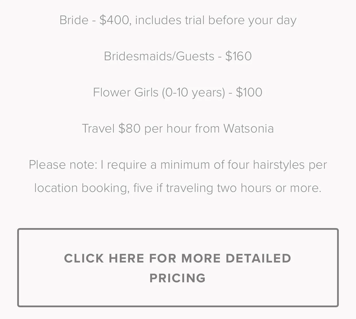
Often small business owners can worry that adding rates to their site will result in less enquiries as it might rule some clients out on price.
I think the opposite.
Adding pricing to your site is a great way of letting everyone know where they stand before they have even reached out to you.
I see not knowing a ball park price before enquiring with somebody for hairstyling a deterrent for two reasons. Firstly, because clients have to send an email extra to ask about and wait for pricing info, and secondly if someone has no idea what you charge they will be more likely to think you will be super expensive POA (price on application) style, and will often go with another business who had it all laid out for them in the first place.
I like to add my pricing just above my booking form so potential clients have to scroll through my rates before enquiring with me – The bonus? Drastically minimises emails back and forth.
6. Not clearly sharing your story
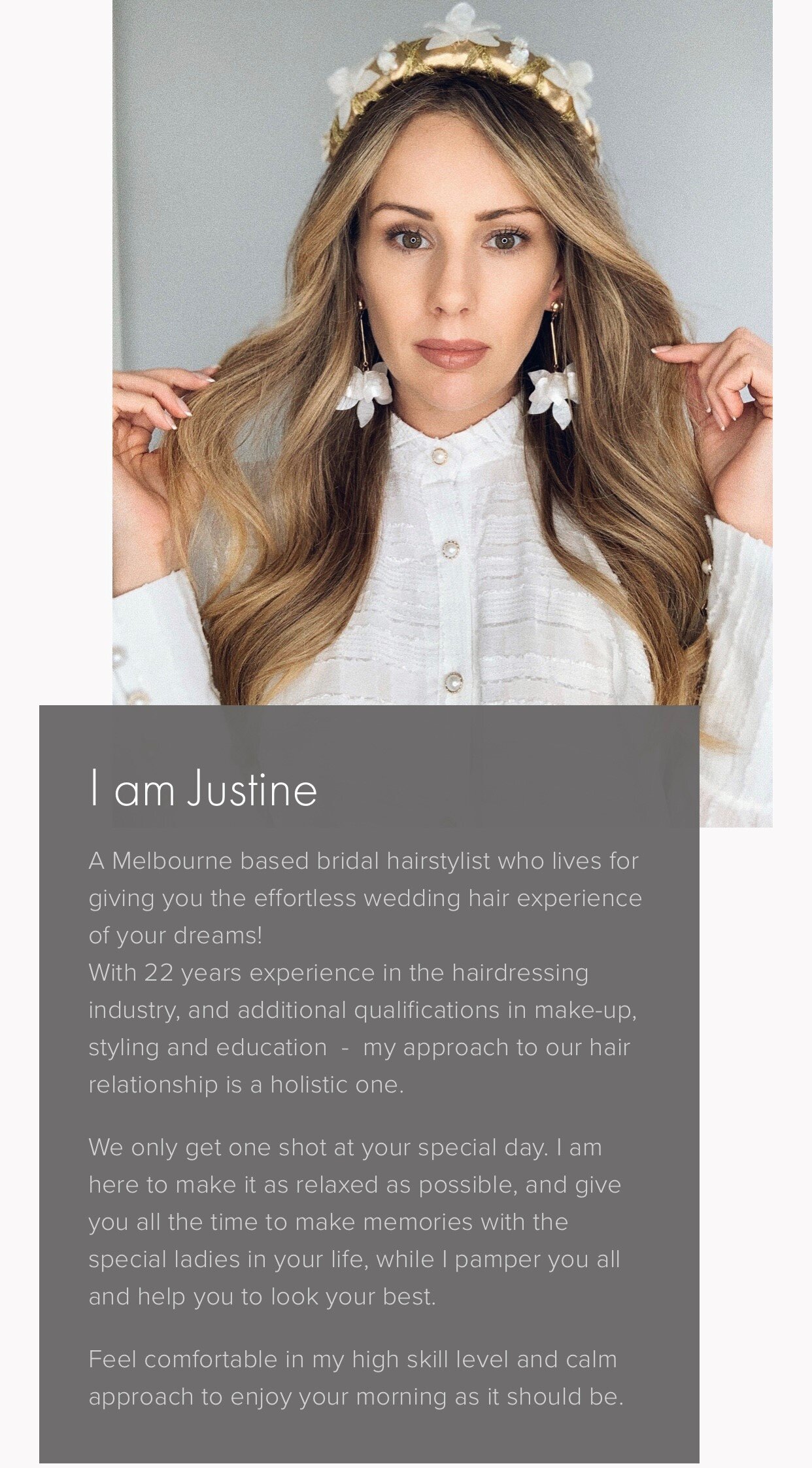
Don’t be afraid to talk to your audience, let them know who you are, why you love this job, and the results you get for them.
If you are a one gal show, refer to yourself as “me” not “us”. This way the person you are communicating with knows they will be getting you, talking to you in your emails and can visualize you being the one doing the service on the day.
If you do have a team of more people, showcase them on your website and explain who each member is and the areas they excel so potential clients know at a glance the set up of your business and what and who to expect throughout their journey with you. This will build trust and understanding from the beginning, setting you up for a prosperous working relationship.
And, there we have the 6 most common website mistakes I see - and actionable tips on how you can overcome each one. I hope you were able to learn something valuable, even the smallest online tweaks can get more butts in your chair.
I would love to hear your main takeaways from this article, and what changes you’ll be making to your online presence.
You can let me know in the comments below, or pop into my Instagram DM’s @polishedstylejustine
Remember, find my free template on how to collect testimonials that sell here.
Wishing you a successful business journey ahead!
Justine x